
Sip & Sing
Making singing social
Logo design completed while working at Squarebird.
branding
stationary
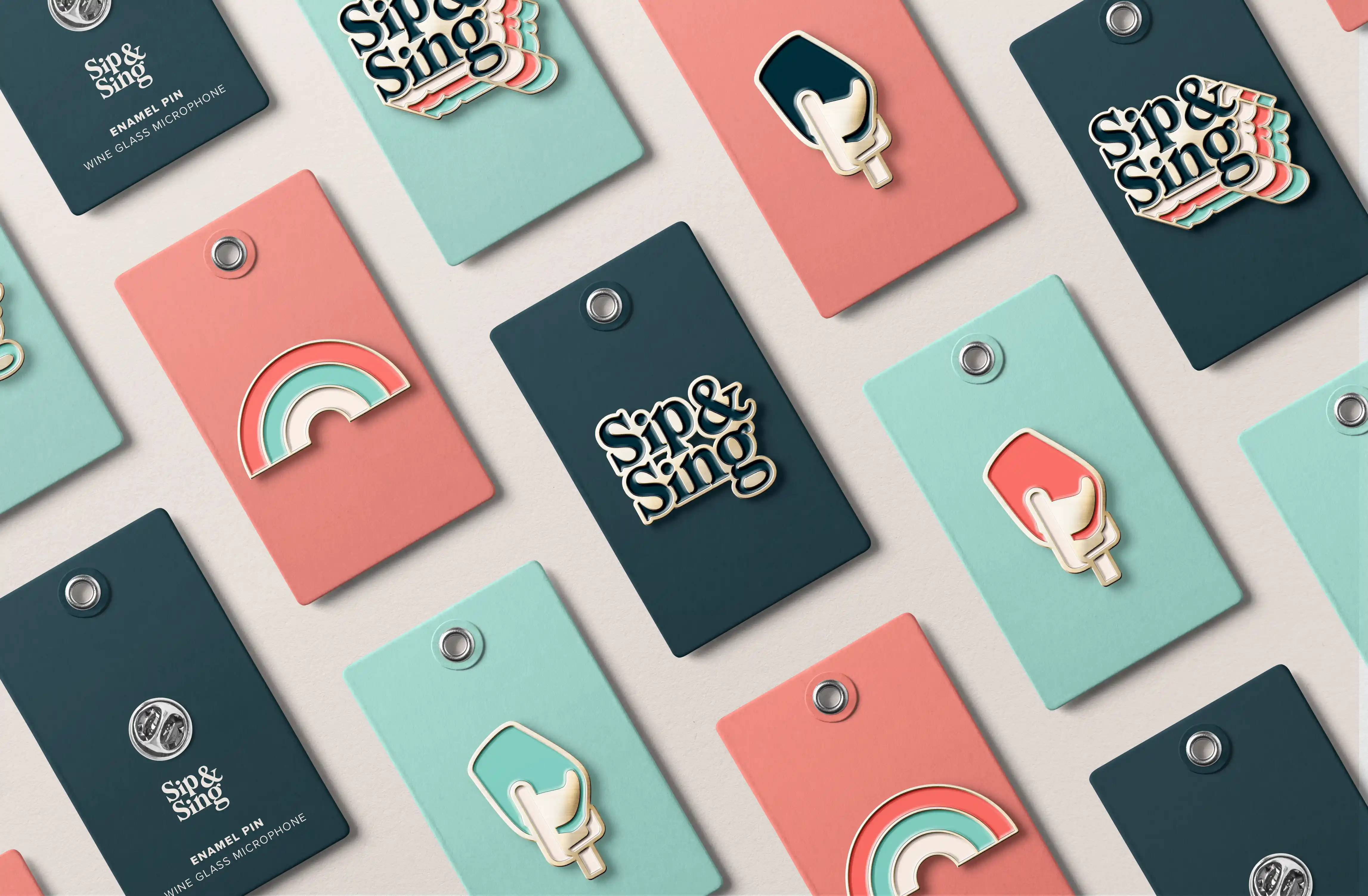
A brand identity designed to reflect the joy, confidence, and sense of belonging at the heart of Sip & Sing. Playful typography and bold colour help the brand feel approachable and energetic, inviting people in rather than putting them on the spot.


The identity was designed to work across a range of touch points like pins and stationery, helping the brand show up consistently wherever the community gathers.
